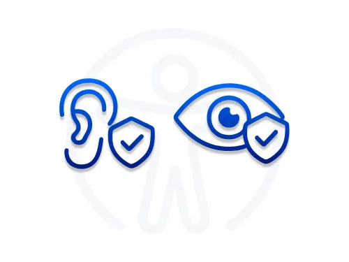
Accessibility best practices at Smarty


An enterprise-level customer of Smarty’s recently shared how impressed they were with our accessibility-first approach, inquiring about how we designed our tools to function in a way that feels equitable and usable for everyone.
At Smarty, one of our core values is outwardness — seeing people as people, not objects or caricatures. Every person who interacts with our tools has their own needs, wants, and objectives, and accessibility is one of the most meaningful ways we connect with people - an area we’re striving to improve.
Every product we build is designed to help people and organizations reach the right place, literally and figuratively. But that mission doesn’t mean much if someone can’t use our tools because they can’t see, hear, or physically navigate them.
Being accessible makes for good engineering, good design, and frankly, good manners.
From how we write HTML to how we design our autocomplete forms, every keystroke, label, and color choice contributes to whether most everyone can truly use what we build.
This post breaks accessibility best practices into two main perspectives: developers (both front-end and back-end) and UX/UI designers. Here’s what you can expect to find in today’s blog about accessibility:
- Who accessibility serves
- Accessibility for developers
- Accessibility for UX and UI designers
- The shared accessibility checklist
- Why accessibility matters to Smarty
Who accessibility serves
Everyone.

Yes, you read that right. Accessibility serves everyone.
A session at HubSpot’s Inbound conference highlighted this in incredible detail. Mobility Mojo’s CEO, Stephen Clusky, presented in a session titled “The impact of making people uncomfortable.” Stephen, a man who was paralyzed from the neck down at the age of 18 by a freak accident with a giant hay bale, made it painfully clear how many people need companies to approach accessibility. He presented these facts:
- 1 in 6 people globally live with one or multiple disabilities.
- 70% of disabilities are not visible.
- 80% of these people are facing unemployment due to a lack of accessibility in the workplace.
But this wasn’t just a heartwrenching tale of inequality. Stephen made it painfully clear that more needed to be done, not only because these people deserve to be seen as people with their own needs, wants, and objectives, but companies inclusive to people with disabilities perform better than their non-inclusive counterparts:
- Inclusive and accessibility-focused companies see 30% lower staff turnover.
- They are 4x more likely to recognize shareholder returns that outperform competitors.
- And they receive 28% greater annual revenue as a result of increased innovation and efficiency.
Accessibility is a win for all.
Think about it. How many times have you—or someone you know—used a wheelchair ramp to roll heavy items into a building on a dolly? Or taken an elevator to skip a single flight of stairs? (No shame. We’ve all treated elevators like a cheat code for even one flight of stairs. 😅)
How many times have you used the larger, accessible bathroom stall because you had a baby to change, a suitcase to juggle, or simply needed room to maneuver without performing a contortion act?
How often have you used a curb cut to glide a stroller, luggage, scooter, bike, wagon, or rolling backpack onto a sidewalk?
Seriously. Sit with that for a second.
Humanity benefits every day from initiatives originally designed for equitable access—but that quietly became conveniences for all of us.

Automatic doors feel like a gift from the gods when you’re wrangling kids into a store, balancing too many grocery bags, or carrying a precarious cup of coffee that absolutely will spill if you try to open the door with your elbow.
Closed captions save the day when you’re nap-trapped by a sleeping child, riding a noisy train, learning a new language, or watching a show where everyone whispers.
Voice-to-text helps with dictation, transcription, hands-free texting, note-taking while your hands are full, and setting kitchen timers without smearing spaghetti sauce on your phone.
High-contrast signs and big, bold fonts in airports and malls help more than just people with low vision—they help all of us find our gate before it’s too late.
Lever-style door handles? They were originally created for people with limited grip strength. Now they’re beloved by anyone carrying a toddler, a laundry basket, or a mountain of Amazon boxes.
Audiobooks started as an accessibility tool—and now half the world “reads” while commuting, exercising, or cleaning the house.
Pinch-to-zoom, responsive mobile design, escalators, grab bars, text-to-speech, closed captioning, wider hallways, accessible seating, visual and audible alerts, ergonomic keyboards… the list goes on.
These were designed to ensure that everyone, including those with disabilities, could access daily life equitably.
However, they ultimately made daily life smoother for all of us.
When we design for those who need it most, everyone wins.
And that’s why Smarty bakes in accessibility from the start. Here are some best practices to follow for a more accessible online business.
Accessibility for developers

The best accessibility starts at the code level. When a site or web app is semantically sound, half the accessibility battle is already won.
Accessibility starts with structure
Semantic HTML provides browsers and assistive technologies with the necessary context to accurately describe a page.
One of Smarty’s (and hopefully everyone’s) accessibility initiatives is that buttons and links should serve separate functions.
A <button> should perform an action.
A <link> should navigate somewhere.
Mixing the two confuses screen readers and users alike.
Likewise, Smarty’s developers don’t rely on visual positioning alone — the DOM order (Document Object Model order, which dictates the reading and navigation order of elements for users and assistive technologies like screen readers) should reflect the logical reading and tab order.
Keyboard navigation is also non-negotiable.
Every interactive element should be accessible and usable without the use of a physical mouse. That means tabbing moves forward, Shift + Tab moves backward, Enter activates a button, and arrow keys navigate within dropdowns or autocomplete suggestions.
If you open a modal, focus should shift inside it; when it closes, focus should return to where the user left off.
Also, remember to use ARIA thoughtfully.
ARIA (Accessible Rich Internet Applications) fills the gaps where native HTML can’t.
For example, in Smarty’s address autocomplete, ARIA roles connect the text input with its suggestion list. Attributes like aria-controls, aria-activedescendant, and aria-live allow screen readers to announce new suggestions and highlight the currently focused one. But ARIA isn’t seasoning for every dish — use it only when standard HTML elements don’t do the job.

Contrast, color, and clarity are where accessibility meets design. All text should meet a contrast ratio of at least 4.5:1 with its background. Error states and status changes shouldn’t rely solely on color; pair them with icons or text cues. And never hide focus outlines — they’re how many users know where they are on the page.
Smarty’s developers run a program in Google Chrome called "Lighthouse". It provides accessibility warnings when the contrast ratio is poor. If it's below the 4.5:1 ratio, we collaborate with designers and UX to develop a strategy to improve it. We value collaboration between design & development to come up with a more accessible result.
**PSST! Performance is also part of accessibility.
Slow pages are inaccessible pages. A “fair” Lighthouse score across Performance, Accessibility, Best Practices, and SEO usually means you’re on the right path.
Smarty recommends keeping your dependencies light, vetting third-party packages for accessibility, and using a linter (a static code analysis tool that analyzes source code to identify and flag potential errors, stylistic inconsistencies, and suspicious constructs without executing it) to enforce best practices automatically. Conducting regular peer reviews of your code will keep everyone up to date and ensure they stay on top of their game.
Accessibility for UX and UI designers
If developers build the scaffolding of accessibility, designers make it intuitive, legible, and welcoming.
Smarty’s Design team designs with flow in mind.
Consistent navigation, clear hierarchy, and predictable layouts help all users — especially those relying on screen readers or cognitive aids.
This means that headings should cascade logically from H1 down, and content blocks should follow a natural order that matches how someone would read or tab through the page.
Forms are where accessibility wins or fails
At Smarty, our autocomplete tools make forms faster to fill out with fewer keystrokes. But that only helps if the form itself is accessible.
Every field should have a visible label (not just a placeholder), clear error messages, and logical keyboard navigation. Users should be able to navigate through suggestions using the arrow keys, select options with Enter, and close the suggestions with Esc. If something goes wrong, error states should be easy to spot visually.
It is now uncommon for an error to trigger an audio notification in a web browser. When there’s an error, we use red (the universal color to indicate “stop”) in the fields where the correction is needed. Smarty also relies on a notification pop-up that displays a summary of what went wrong, allowing us to troubleshoot for a more accessible option.
Visual contrast and legibility

Use fonts that are clean and easy to read, maintain sufficient spacing for comfortable scanning, and ensure your color palette is accessible to everyone. Don’t rely solely on color to convey meaning (as some individuals are color vision deficient), and ensure touch targets on mobile devices are large enough to tap comfortably.
Put it to the test
Test with real users, not just tools. Automated accessibility scanners like Lighthouse or aXe are invaluable, but they’re not human.
Try navigating your design using only a keyboard. Enable a screen reader, such as NVDA or VoiceOver. Zoom to 200% and see if your layout holds.
Real accessibility comes from seeing—and hearing—what the user experiences in various use cases. In fact, many of our developers have turned on a screen reader to hear if the page is logical and flows well, tabbing through the links to hear if the navigation and other components make sense from an audible standpoint.
We encourage you to do the same!
The shared accessibility checklist
When design and development come together, accessibility becomes second nature. Before any release, our teams run through a quick shared checklist:
- Can you navigate everything by keyboard alone?
- Do text and background colors pass contrast ratios?
- Are form fields clearly labeled, and do error messages appear in a clear manner?
- Does focus move and return where it should, especially when users move between tablet, mobile, and desktop versions of your site?
- Can a screen reader announce what’s happening in dynamic areas like autocomplete lists?
If the answer to all five is yes, the experience isn’t just accessible — it’s better for everyone.
Why accessibility matters to Smarty
Accessible design isn’t about meeting WCAG guidelines (though that’s the standard). It’s about empathy. It’s about building tools that invite everyone in. Whether they’re using a keyboard, a screen reader, a touch screen, or just one hand on a phone, an accessible approach is the best and frankly only approach you should take.
At Smarty, accessibility is another form of precision. The same care we put into verifying every address goes into verifying every interaction. Because getting someone to the right place shouldn’t depend on how they browse, type, or see. It should just work.
Want to see our accessibility features in action? Just test out some of the tools we have, completely free. We’ll drop the links below.
Accessible autocomplete:
US Address Autocomplete and International Address Autocomplete: Addresses populate in a full keyboard navigation with properly associated input and suggestion list elements. Screen reader announcements as suggestions appear, update, or are selected, high-contrast highlighting for the active suggestions, and logical DOM order so the reading and tab order reflect what users see visually make Smarty’s autocomplete solutions the accessible choice.
Give your internal teams and external users the gift of being able to have real-time and accurate address predictions populate as they type.
Accessible verification/validation
US Address Verification and International Address Verification provide clean, semantic responses designed to integrate into accessible user interfaces using predictable error and status codes so developers can communicate issues clearly to users, including those relying on assistive tech. They also provide support for fully accessible form patterns, including visible labels, descriptive instructions, and strongly typed return structures that reduce ambiguity in UI presentation.
*Note: “Strongly typed” means that data sent from a server to a user interface (UI) is strictly defined by specific data types (like integer, string, boolean, or a specific object format). This strict definition ensures the UI developer knows exactly what kind of data to expect, which in turn reduces errors and makes the UI clearer and more predictable for the end-user and their accessibility tools.
Keep your datasets clean over time by verifying, validating, standardizing, and deduplicating your address datasets.
Accessible geocoding
US Rooftop Geocoding, International Geocoding, and US Reverse Geocoding are built to behave consistently across interfaces, but also to support machine-readable responses that assistive technologies can interpret cleanly. Additionally, Smarty’s geocoding technology has structures that integrate with map UIs using standard, accessible patterns (keyboard-navigable map markers, text-based coordinates, and screen-reader-friendly location descriptions). Smarty provides clear fallback behavior when addresses are ambiguous or not found, enabling developers to present accessible messaging and guidance.
Your lat/long coordinates should be accurate and accessible, and they can be both with Smarty.
Accessible address enrichment
US Property Data, US Census Block and Tract Data, and US Secondary Address Data (we love enrichment) are designed for clarity and readability, which form the foundation of accessible data workflows. They support accessibility by offering consistent, structured, and semantically meaningful field names, easy-to-parse metadata that’s mapable to UI components such as tables and sections, and clear distinctions between optional and required fields with predictable error handling that provides context to users.
Because enrichment APIs return data in clean, standardized structures, developers can present the information in ways that meet WCAG guidelines for tabular data, responsive layouts, and high-contrast displays.
Was this helpful?
